Overview
Tonifidance is an aerobic fitness program combining movements inspired by Brazilian popular dance and toning body muscles, resulting in a fun and energizing exercise.
Logo
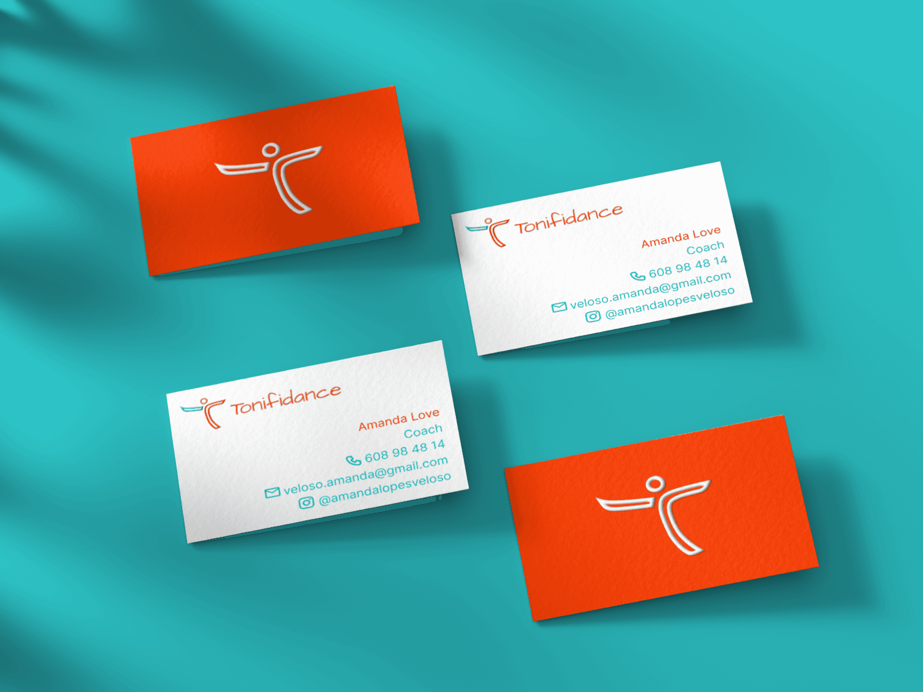
The logo represents the vibrant movements of dance, impersonating a dancer with the letter T. The round and fluid lines bring a creative energy and the 3D effect makes the logo modern and memorable.
Color Palette
Color is a powerful component of a brand identity. It creates a first impression and can influence how the brand is perceived in the minds of the audience. The color palette for Tonifidance is bright, colorful, and fun, with influences of Brazilian vibrant culture and scenery. The yellow brings an energetic and enthusiastic meaning, the orange warmth has a cheerful and friendly energy, and the turquoise sets for positivity and creativity, combining the identity Tonifidance wants its audience to perceive.
The primary palette uses a bright color scheme to highlight the positive nature of the brand. They feel modern and work easily together. The secondary palette can be used in specific applications, on print and web products to bring variety and contrast.

