Aline Veloso
Product designer | UI UX Designer
Sustainable Life
Mobile UX Design & Prototype
Brito
Product Design | Web design | UX Design
Anooka Health
UX Design | App UI Design | Prototype

Lasha
Product design | App Design | UX Design
Contact
About me

Hello, I'm Aline!
I navigate the exciting world of visual and product design. I am passionate about user-centered experiences and finding new ways to combine function and aesthetics in web, mobile, and marketing products.
My design journey began with a solid foundation in design principles, carefully developed over years of formal education. I hold a certificate in UX Design from York University and a Bachelor's degree in Fashion Design from Federal University of Ceara, where I not only acquired technical expertise but also developed a profound appreciation for the beautiful union of aesthetics and functionality.
My tech stack features design tools such as Figma, Framer, Squarespace, and Miro. I’m committed to pushing boundaries and exploring emerging technologies and design trends to keep my work both timeless and innovative.
Lasha
Product design | App Design | UX Design
2025
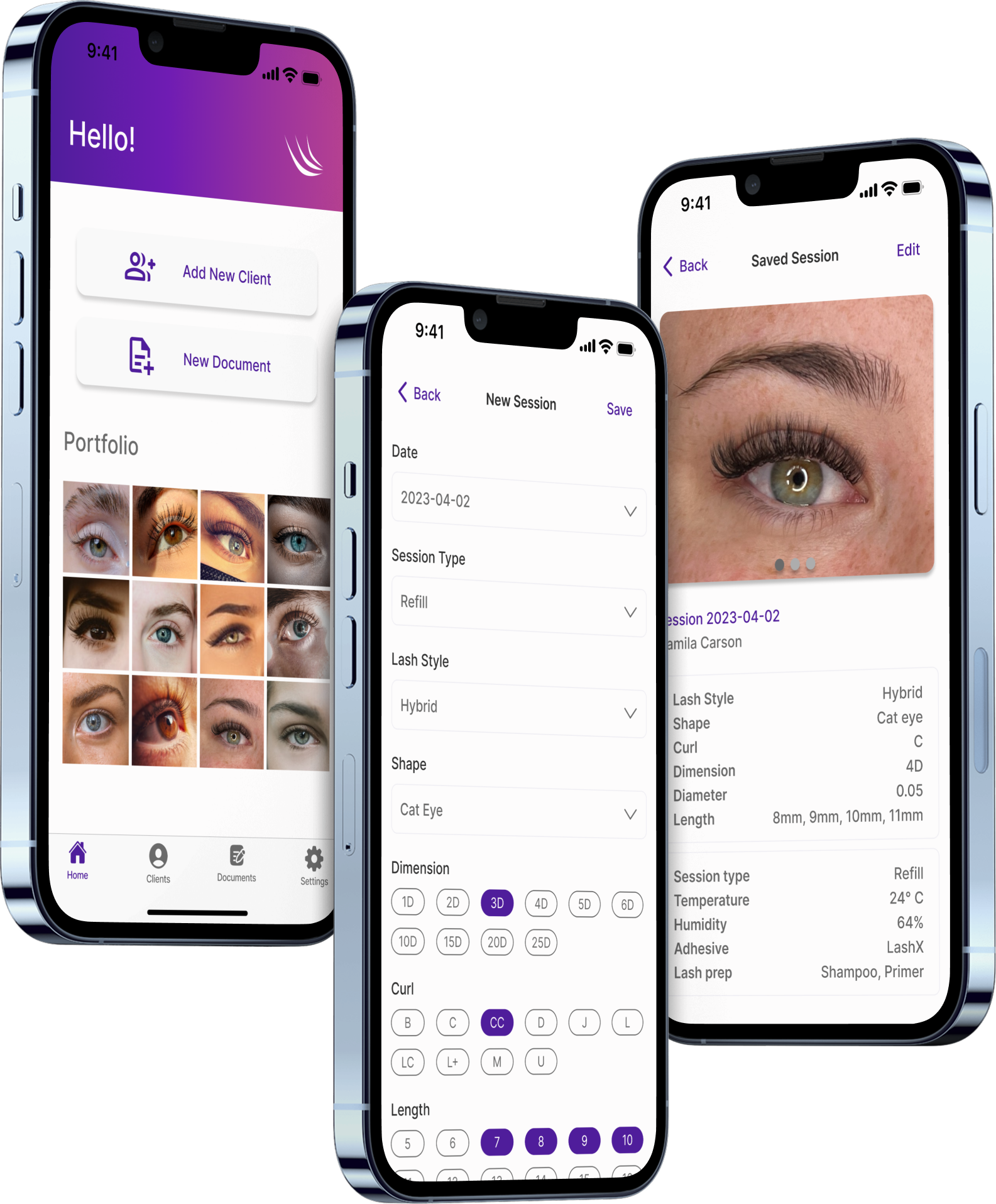
More information coming soon!
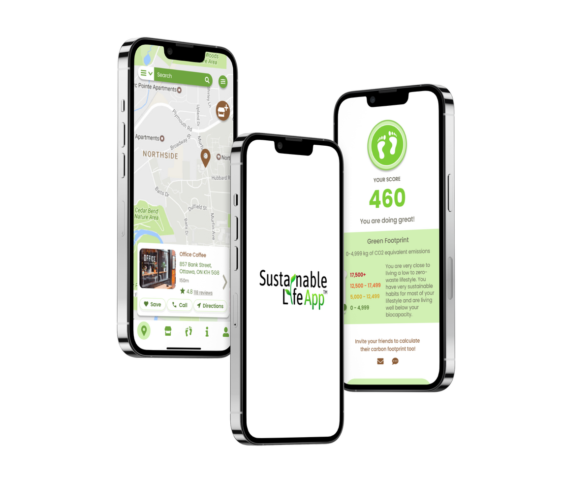
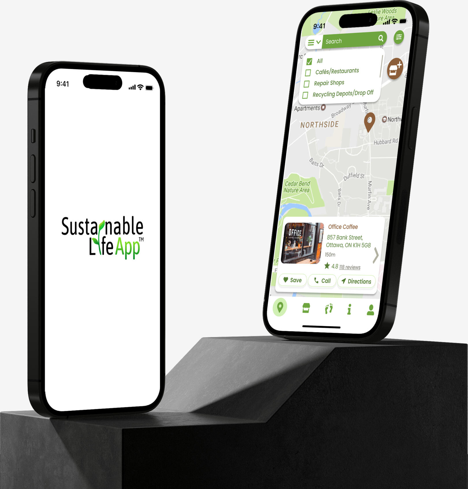
Sustainable Life App
Mobile UX Design & Prototype
2023
Overview
Sustainable Life App is a free app helping communities reduce waste and create a circular economy by connecting eco conscious consumers with sustainable businesses and brands in their area.
Intent Scope
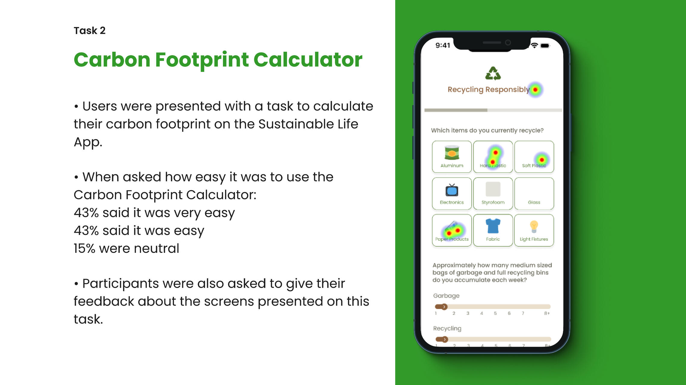
The intent is to provide high-fidelity prototypes for the redesign of the Sustainable Life App, focusing on:Update the UI/UX Design of the existing mobile app, keeping a consistent visual and information architecture to improve the user experience.Design prototypes for a new feature, the Carbon Footprint calculator, keeping consistency with the UI design.Conduct Usability Testing to ensure the design choices for enhanced end-product usability.
User-Centric Research
The project started with an analysis of previous user research including survey results, user interviews, personas, etc. The client also provided the opportunity to enroll in their eCourse about sustainable shopping, aimed to understand better the final user and their behavior when searching for sustainable businesses and brands. To continue with the research, I conducted a competitor analysis focusing on apps that provided searching maps on local sustainable shops and on apps that provided carbon footprint calculators.
Mid and High-Fidelity Wireframes
We've developed a series of wireframes illustrating potential opportunities for the client including some additional screens with business deals banners to enhance discoverability on the final user side and marketing opportunities for the businesses and the app. The client decided to keep the initial scope because of timing, leaving the suggested ideas for the next phase of the project. Presenting these wireframes to the client allowed us to iterate on our ideas and narrow down the scope of the next phase, User Testing.
Usability Testing
A usability testing was performed to validate the design choices for the new interface of Sustainable Life App, especially related to the new feature being implemented, the Carbon Footprint Calculator. The testing was hosted on Useberry, a platform that enables participants to enroll remotely in their own time and devices, performing tasks established by the UX Designer.After gathering the results, an iteration process was performed to align the design with users' feedback and the client's wishes.
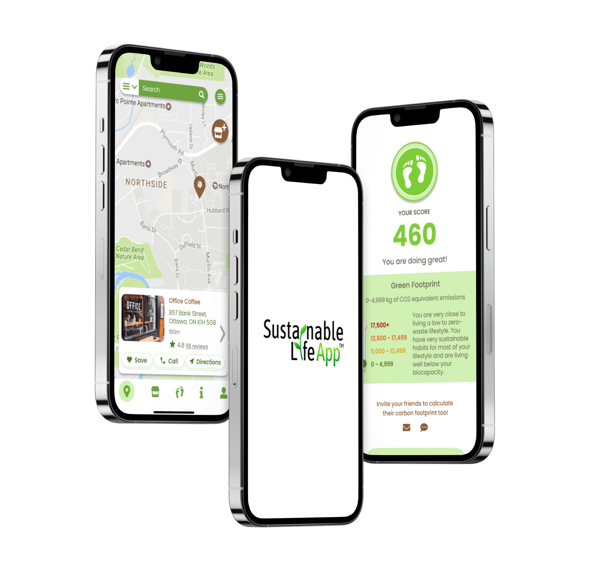
Final Product
I iterated on my previous wireframes using feedback from all previous phases to arrive at a series of clickable prototypes that were approved by the client to start production and development phases. The new UI is currently in development.
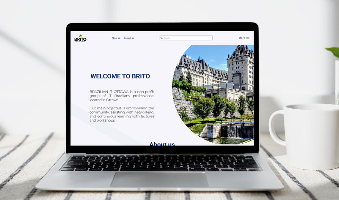
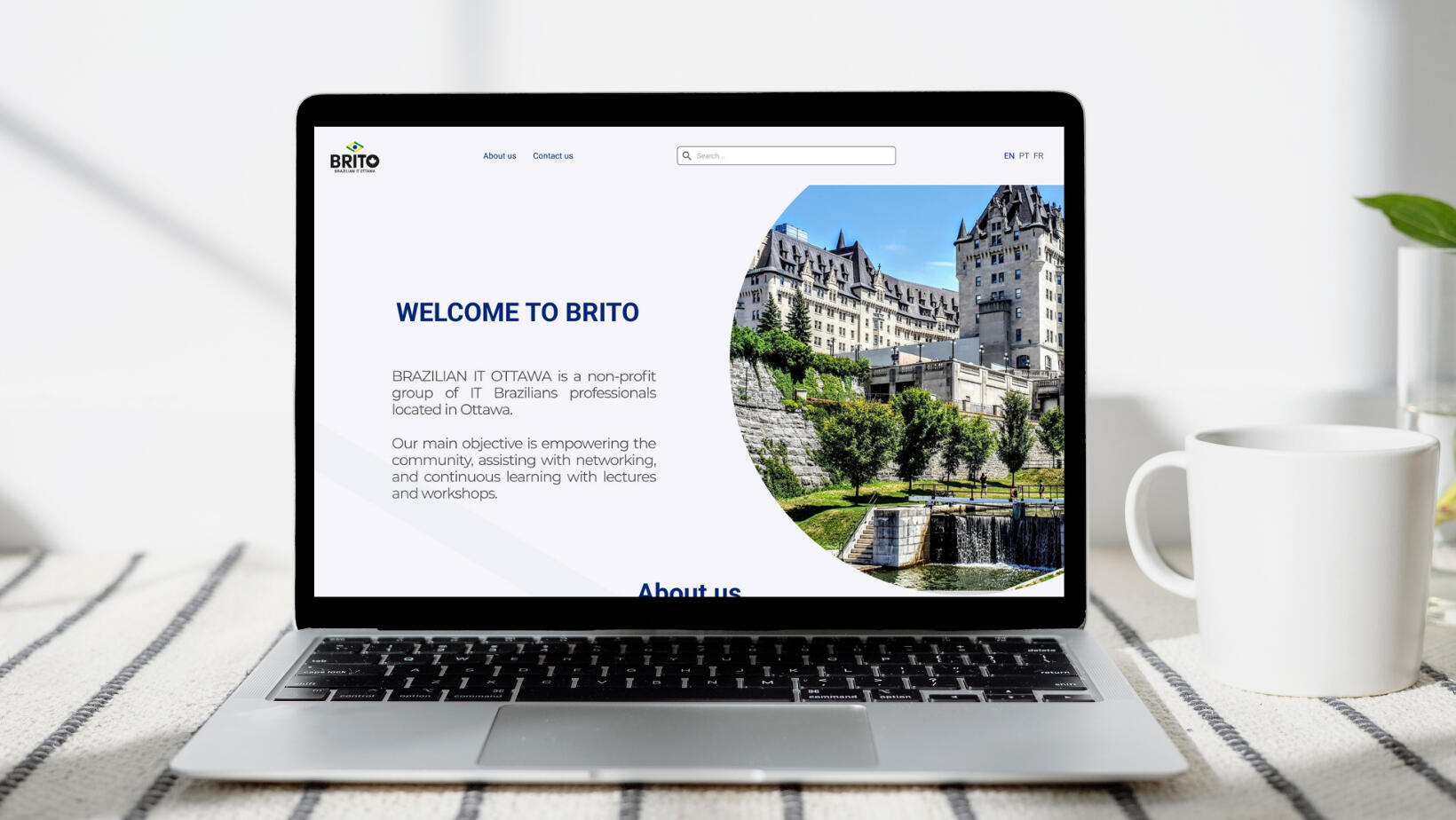
Brito
Product Design | Web design | UX Design
2022
Overview
Brito (Brazilian IT in Ottawa) is a non-profit group that gives support to Brazilian immigrants living in the Ottawa region to develop a career in Information Technology. They host networking events, help each other by sharing knowledge and experiences, building a social and professional network. Our challenge was to design a website for the client.
Problem
Brito currently offers its services on Facebook and Whatsapp groups, which is functional but they wanted to transition to a better onboarding for their new users. We will be defining that experience and flow by researching the problem and producing a high-fidelity prototype.
Expected Outcomes
Produce a high-fidelity responsive prototype.Improve the overall experience for new users, so they can find the information that they need without much effort.Deliver a website design that is clean, easy to understand, and that brings all that information the user needs to understand and start using Brito's services.Include a registration form for future events and communication.
User-Centric Research
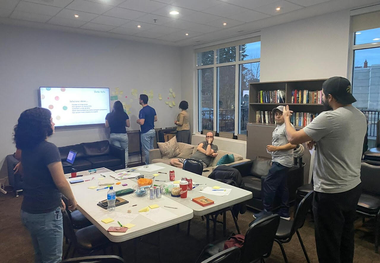
By running a survey with existing group members and analyzing existing data, we've defined 3 personas to scope the user target for the interviews. We've facilitated a brainstorming workshop to generate solutions for each persona's pain points and conducted exploratory research through a series of user interviews with existing users of the Brito services, based on the personas previously defined. The team also conducted competitor analysis in the non-profit newcomer's support industry.We've facilitated a brainstorming session with a group consisting of 5 users and part of the development team to explore ideas and create collectively a journey map for the personas.Mapping all the research findings led to the creation of a journey map and low-fidelity sketches. These artifacts were used to further iterate our designs.
Low and Mid-Fidelity Wireframes
We've developed a series of wireframes illustrating potential opportunities for the client including some additional pages like a Job Board, an Events page, and a page to host Learning opportunities. The client decided on a Minimum Viable Product with just the essential information for the new users' onboarding, leaving the suggested ideas for the next phase of the project. Presenting these wireframes to the client allowed us to iterate on our ideas and narrow down the scope of the next phase, User Testing.
User Testing
We presented our prototypes using Useberry to 10 individuals for usability testing, and our focus areas were: website first impressions, the network contact form, and suggestions. The results of this testing would be used for further design iteration.
Final Product
We iterated on our designs using information from all previous phases to arrive at a series of clickable prototypes that was approved by the client to start production and development phases.
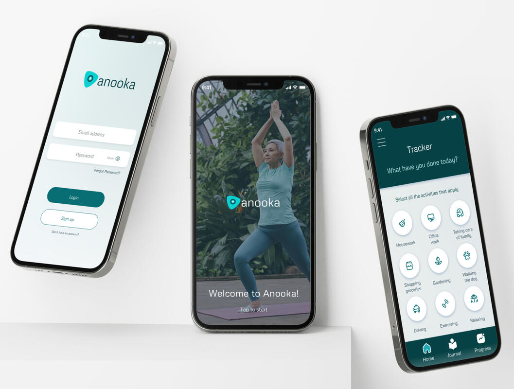
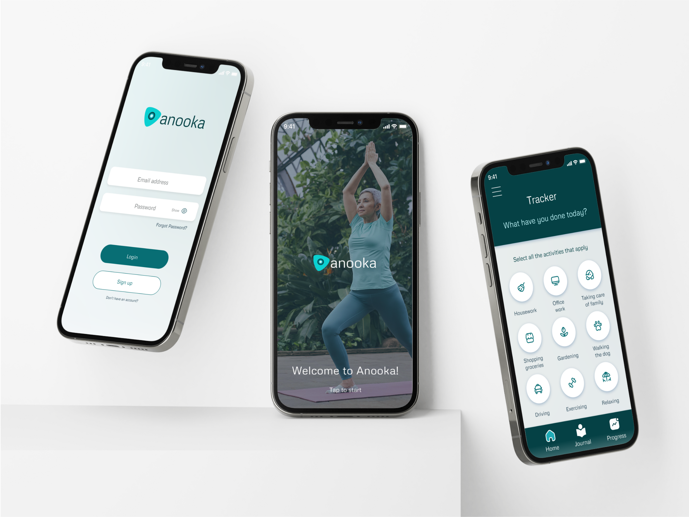
Anooka Health
UX Design | App UI Design | Prototype
2022
Overview
Anooka Health is a web platform that helps people suffering from chronic pain to have a better quality of life. It offers personalized care programs using cognitive therapies that are suggested by a health coach. Our challenge was to design a mobile app version for the client.
Problem
The current Anooka Health web-based platform is functional, but we will be helping them transition to a better mobile experience while having an engaging onboarding process. We will be defining that experience and flow by researching the problem and producing a high-fidelity prototype.
Expected Outcomes
Produce a high-fidelity prototype that includes these 4 key components: journaling, tracking and feedback, rewards, and education.We plan to improve the overall experience for patients and health coaches by organizing the different components and pieces of information of the Anooka Health app, so they can find the information they need without much effort.Our goal is to help users understand all the connections between the features of the product so they can stay engaged and complete the different tasks in the app.
User-centric Research
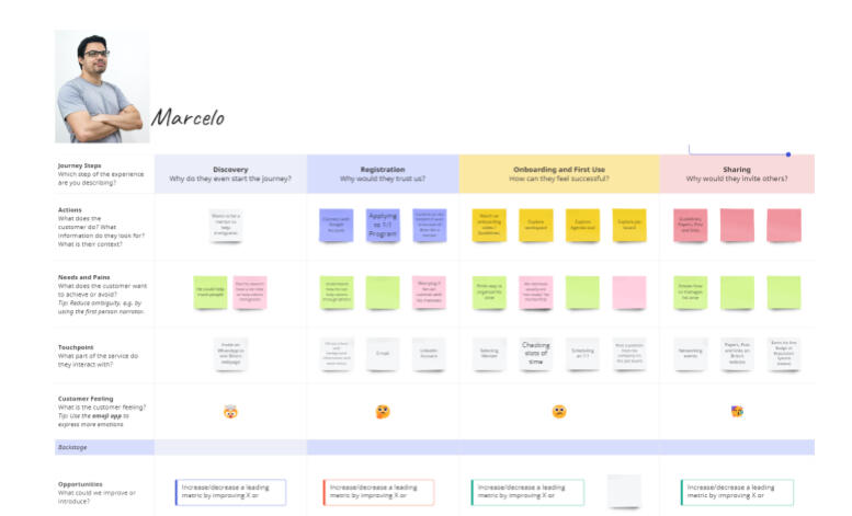
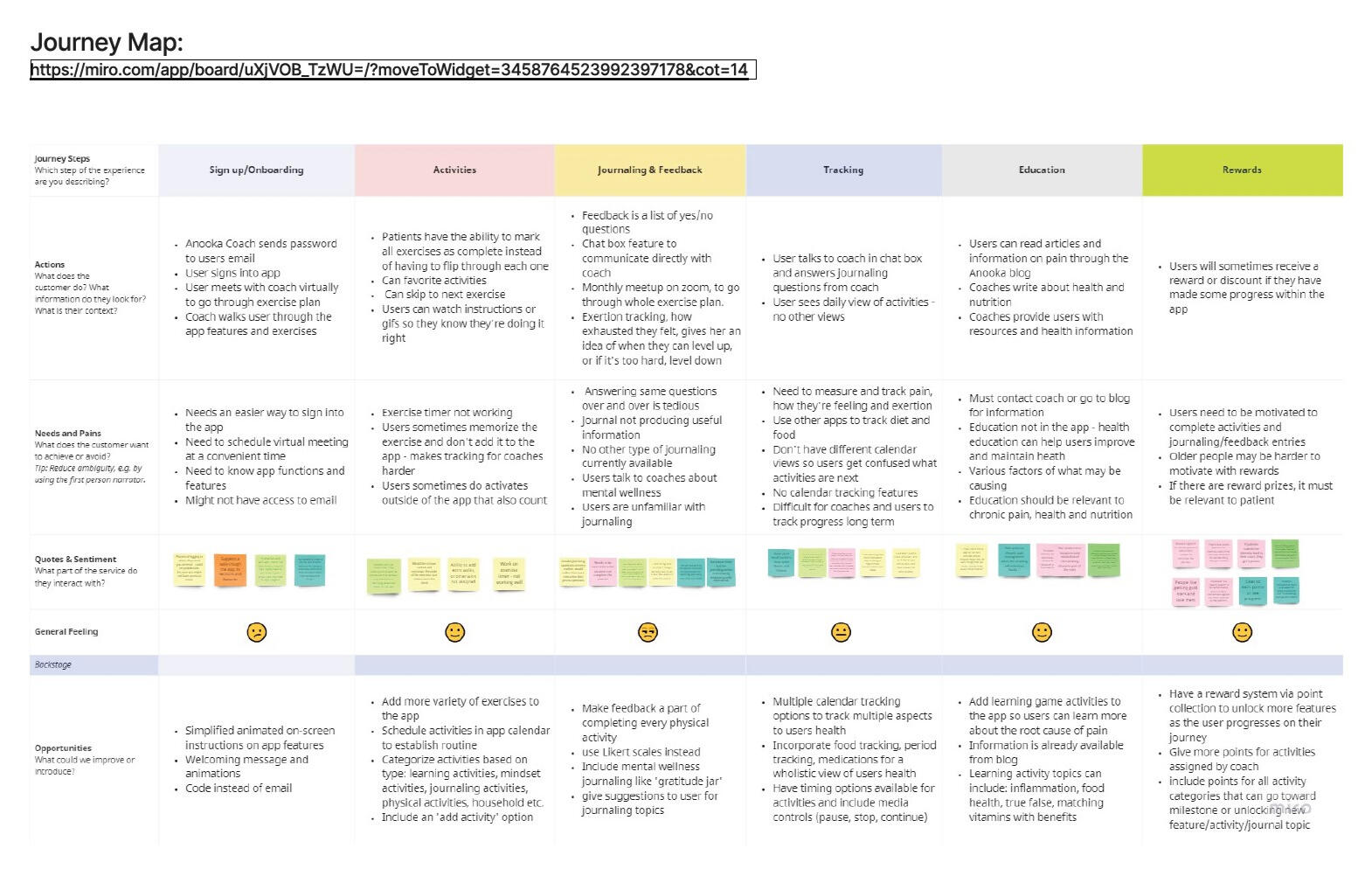
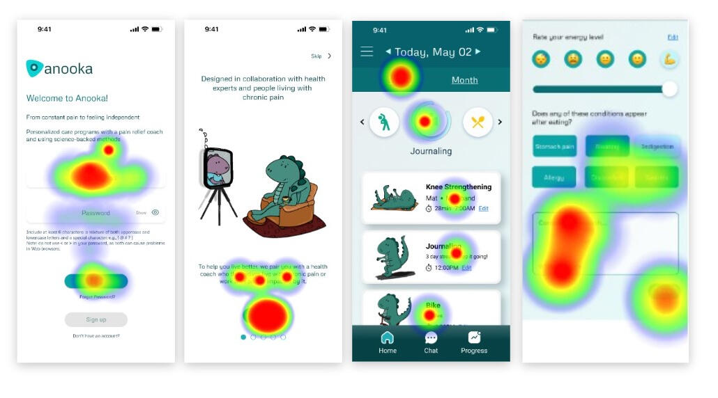
We conducted exploratory research through a series of user interviews with both coaches and existing users of the Anooka health platform. The team also conducted competitor analysis in the chronic pain management industry and other apps that offer similar aspects of the 4 key features that Anooka Health is focusing on delivering on the mobile app. We finally defined 5 research goals for the project.The information and insights from our user interviews and competitive analysis were collected and grouped into themes on a Miro board. This process allowed us to analyze and organize the information, and we were able to notice many key findings for Anooka Health’s mobile platform and come up with some recommendations.Mapping all the research findings led to the creation of a site map, journey map, and low-fidelity sketches. These artifacts were used to further iterate our designs.
Low and Mid-Fidelity Wireframes
We developed a series of wireframes illustrating potential choices for the client in the areas of patient onboarding, homepage, journaling, progress tracking, and education. Presenting these wireframes to the client allowed us to iterate on our ideas and narrow down the scope of the next phase, User Testing.
User Testing
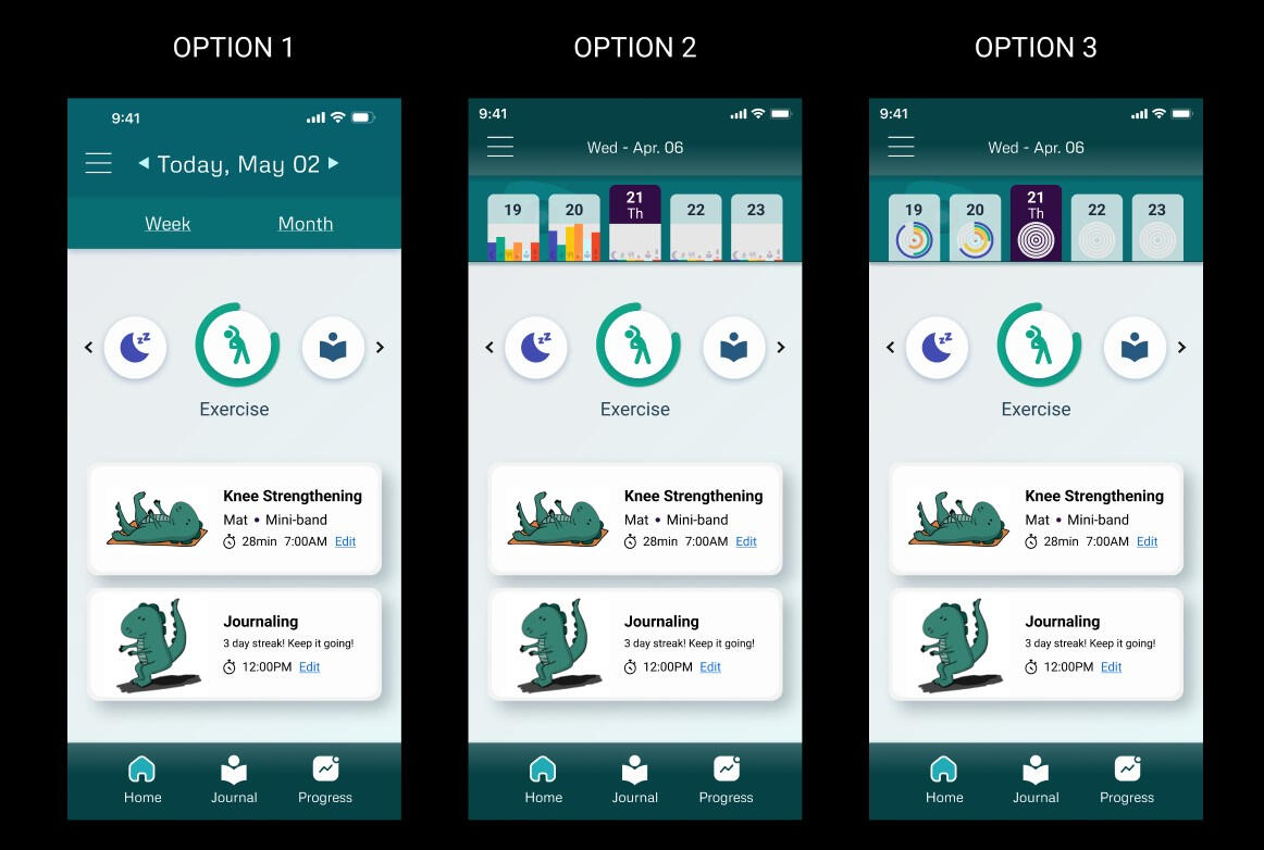
We presented our prototypes using Maze to 9 individuals for usability testing, and our focus areas were onboarding, homepage, exercise routine, journaling, and food logging. The results of this testing would be used for further design iteration.After presenting high-fidelity prototypes to the client, A/B Testing was requested for the activity tracker on the homepage. Three options were presented to users, and Option 2 was preferred.
Final Product
We iterated on our designs using information from all previous phases to arrive at a series of clickable prototypes to bridge some of the gaps that would appear on a mobile version of the product, and effectively design new features while keeping consistent design and information architecture to improve the user experience.